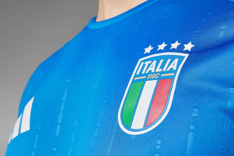
Only five of the 24 teams are not sponsored by Nike, Adidas or Puma. The Macron and Joma brands have two teams each, and Hummel has Denmark.
But who has the best kit? Flashscore has ranked all the Euro 2024 teams according to the aesthetic appeal and popularity of their jerseys. Check them out below.
The tournament will be played in Germany from 14 June.
Follow Euro 2024 on Flashscore
Ranking of Euro 2024 kits
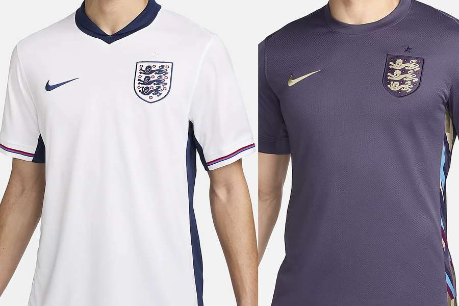
1) England
A new classic is born. The clean kit emphasises the blue and red details, which in fact resemble the jerseys of the 1966 and 1990 World Cup teams - the best in England's history.
The second shirt has a slightly odd colour, but the Three Lions are still at the top of the rankings.
2) Italy
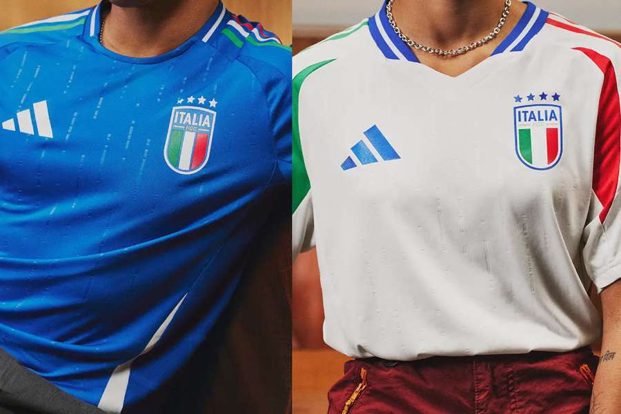
The Adidas jersey for Italy is simple and brilliant. The three colours work perfectly on this template, and the shade of "azzurro" is just right.
3) Denmark
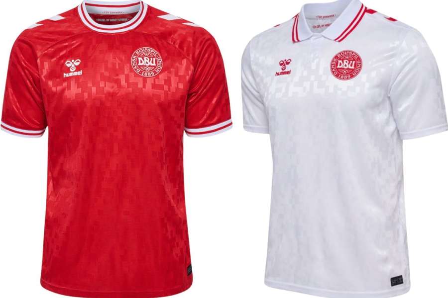
Hummel's only shirt in the tournament is worthy of the great classic kits of the early 1990s.
Silky, shiny, full of little touches and a blood-red colour. Marvellous.
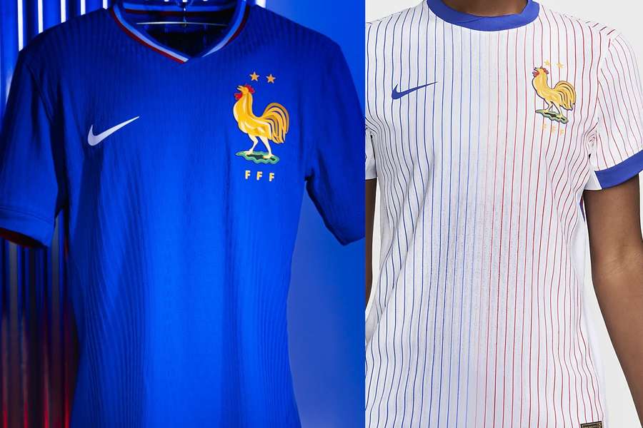
4) France
The France shirt is always a hit. This time Nike has brought in a lighter blue colour, but has kept the elegance.
Point also for the second shirt full of stripes.
5) Croatia
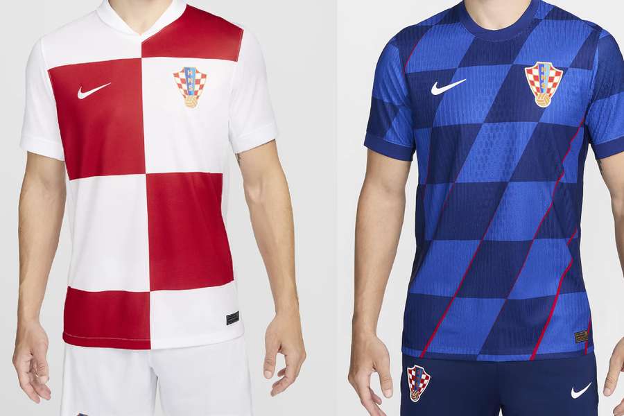
Almost always a unanimous favourite, Croatia's jerseys are not at their best for Euro 2024.
The chequered pattern of the first shirt has gained giant squares, while the second shirt now has lozenges (or slanted squares?).
Even so, Nike hasn't managed to spoil the Croatian uniform.
6) Belgium
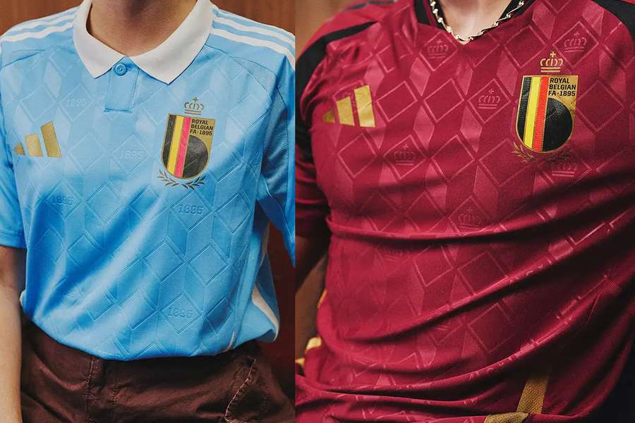
Adidas has gone bold with the new Belgian shirts. The inspiration ("contemporary architecture and luxury fashion design") is questionable, but the end result is somehow great.
The vintage emblem goes very well with the wine-like colours on the home shirt and the controversial baby blue on the away kit.
7) Portugal
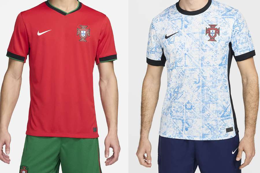
The home shirt is perhaps too plain and lacks a bit of green. But the second shirt, with its famous Portuguese tiles, is perhaps the best away kit in the whole list.
8) Georgia
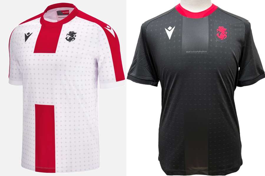
Georgia will be playing in their first European Championship dressed as if they were playing in England's second division.
Which is pretty cool, actually. Designed by Macron, the home shirt has a centre stripe that resembles the country's flag. And if the second shirt didn't have a glossy rectangle in the centre, the Georgian team would have scored even higher in our rankings.
9) Netherlands
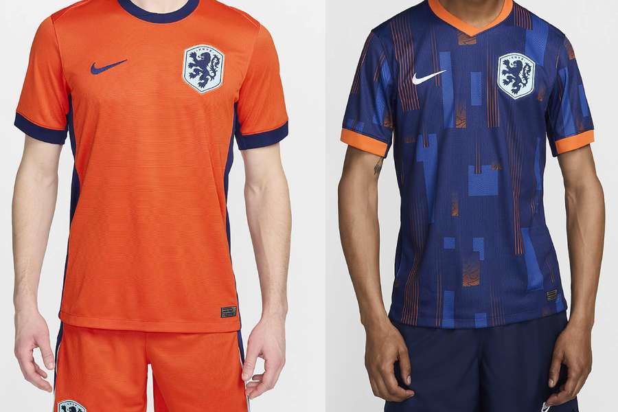
Nike did the right thing by favouring a less reddish orange for the first kit, although they didn't get the pattern right for the away jersey.
But as the Netherlands are another country whose shirt is difficult to ruin, they take our 9th place.
10) Austria
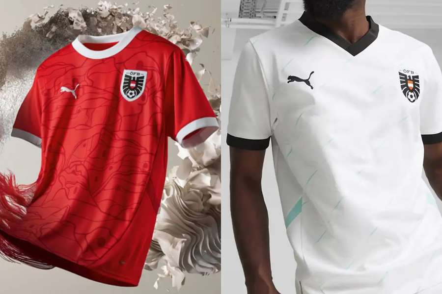
At last an interesting shirt from Austria! The home kit has a bit of character as well as a great round collar.
The second shirt has a strange tinge of blue, but it's still decent.
11) Serbia
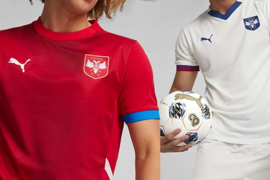
Simple, velvety and stylish. Not very creative, but pretty decent work from Puma.
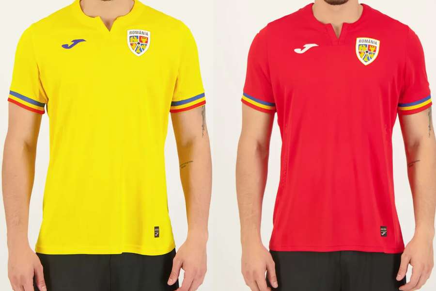
12) Romania
Romania's shirts are almost a waste. The South American/African colour scheme of the country's flag deserves something better, but there is still some merit in Joma's collection.
The shirts are clean and pretty, which means you can go out wearing either one.
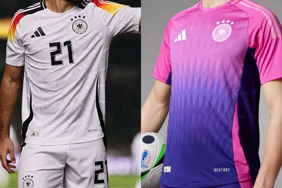
13) Germany
With a fiery gradient and details reminiscent of the Germany shirt from the 2006 World Cup, Adidas got it right again with the design in their Euros with the tournament hosts (Germany will move to Nike in 2027).
The second shirt, on the other hand, is a bit controversial, as it looks like a goalkeeper's uniform.
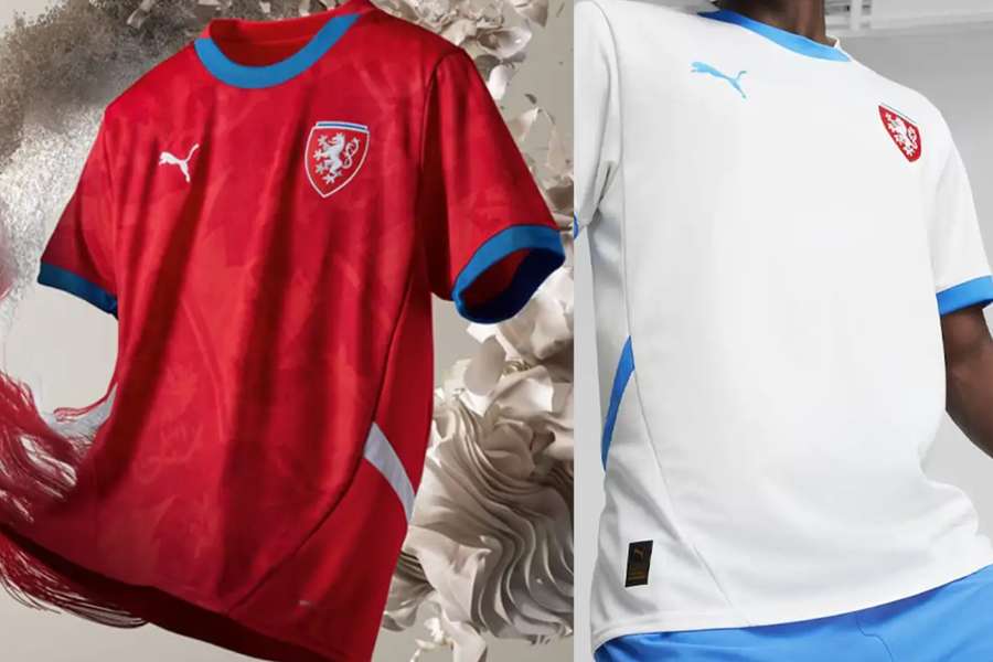
14) Czech Republic
Plain jerseys with a nice texture and good use of the world's most common primary colours.
Some credit for Puma on this one.
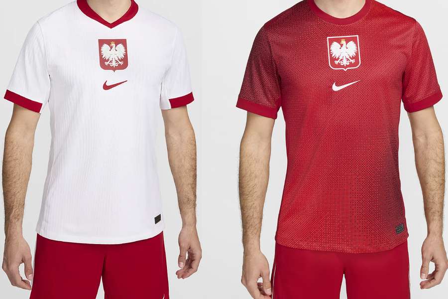
15) Poland
Like Serbia's, it's simple and straightforward. The contrast between red and white makes this simplicity work very well.
And with the giant symbol adopted by Nike this year on various kits around the world, the simpler the shirt, the better.
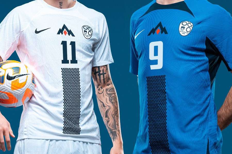
16) Slovenia
The Slovenian team has the most unique kits of all the Euro teams.
The shirts feature the Triglav on the chest - the country's symbol hill - giving them a bit of an MLS vibe.
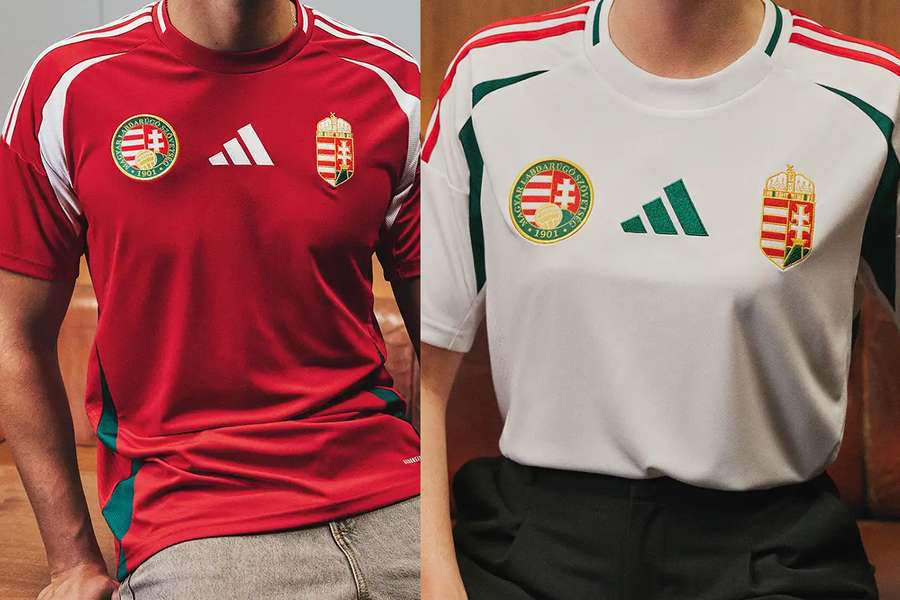
17) Hungary
There's a lot going on in the centre of the shirts. Less, guys, less.
What saves the jersey is the infallible green-red combination a la Fluminense.
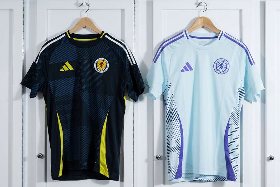
18) Scotland
Adidas' big blunder in the tournament. It's not easy to go wrong with Scotland's home shirt, but the German manufacturer managed it.
The blue isn't what we all love, the yellow doesn't help at all and the pattern is very messy.
The second shirt doesn't appeal either, with its faded purple colour.
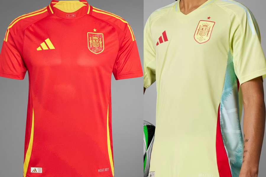
19) Spain
The first team shirt has no frills and is great, although it's a pretty powerful red.
The problem is with the away shirt, which is so hideous that it needs no comment.
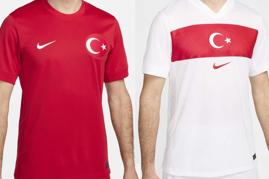
20) Turkey
The designs are very similar to those of the last Euros. Nike lacked imagination with Turkey, but the shirts aren't ugly.
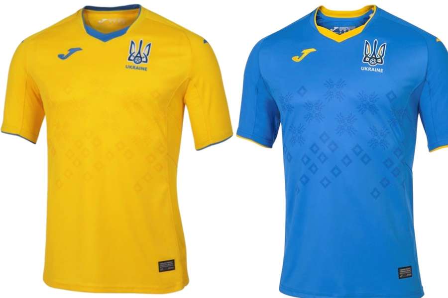
21) Ukraine
Ukraine shouldn't be in this ranking, as their colours are still those of 2021.
The country disagreed with Joma because the manufacturer wouldn't stop sponsoring Russian teams, the contract was broken and there is no new shirt.
Adidas will take over the production of the Ukrainian kits, but only after the tournament. That's all we have for now.
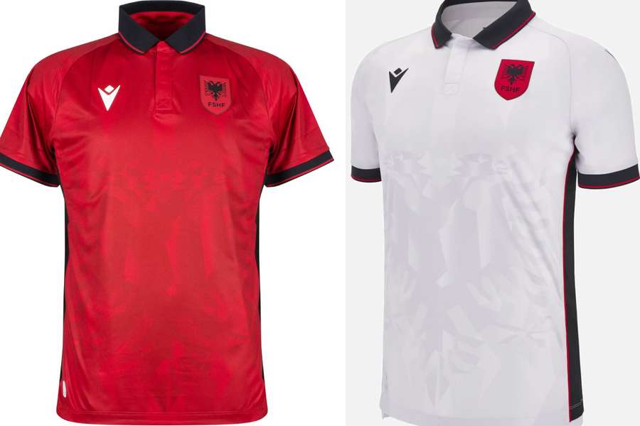
22) Albania
Very lazy work by Macron. Not impressive. The highlight is the fantastic collar that Eric Cantona would sign off on.
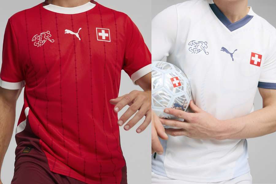
23) Switzerland
It seems quite complicated to make Switzerland's jerseys, since year in, year out, they're always pretty bad.
This year's Puma collection would be the best in recent times if it weren't for a brown colour on the underside of the home shirt. It looks like they spoilt it on purpose?
24) Slovakia
Worse than wearing an old shirt is wearing Slovakia's new one. The first kit is completely white, but not at all reminiscent of Real Madrid. The blue away shirt has a few generic red details just for the record.
The Slovakian collection was the last of all the national teams to be launched - and it seems that Nike forgot to design a model and had to grab something from the cupboard at short notice.
